Five rounds to a blog logo with an AI agent — the /logo skill and three scripts they left behind
Redesigning this blog's logo and code font with an AI agent: a broken SVG letterform, a regex bounding box, a wrong kanji, and the /logo skill it produced.
On this page
Introduction
I sat down to fix a logo I had not been happy with for a long time: a plain text mark this project generated for itself on day one, and that nobody had made a decision about since.
Designing one with an AI agent is not a single-shot job, and I did not want it
to be. What I wanted to know was whether the loop itself was worth writing down
as a Claude Code skill: the agent generates candidates, I look, I cut, I say
why, and we go again until I am satisfied. The agent was confidently wrong
five separate times across those rounds, and I count none of it as wasted.
Each wrong turn named a rule, and the rules are now a /logo skill and three
scripts that the next mark starts from.
What shipped is a vermilion seal bearing 桜 next to “oharu” set in Fraunces, plus JetBrains Mono on article pages only. This article walks through the five rounds, what each one cost to find, and the skill they turned into.
The blog had no design, and I had been living with it
Here is what the favicon was:
rect and one <text> element asking for
Helvetica,Arial,sans-serif, at the three sizes a favicon is used at. The
letter is whatever the visitor’s operating system supplied.Not a logo. A placeholder I had been living with. The header had no mark at all, just the site title as text.
The typography was the same story:
--font-sans: ui-sans-serif, system-ui, -apple-system, 'Segoe UI', Roboto, …;--font-mono: ui-monospace, 'SF Mono', SFMono-Regular, Menlo, Consolas, …;Pure system stacks. So the font was not boring. There was no font. Every visitor was looking at their own operating system. That is a legitimate trade (zero bytes, zero layout shift), but it was not a decision anyone had made.
Wrong turn 1: twenty-four variations of one idea
I asked for breadth first: twenty-four concepts across icon-only, wordmark, and combination marks, rendered into a gallery showing each at 128px, 32px and 16px at once.
It produced twenty-four of them. They were all the same logo.
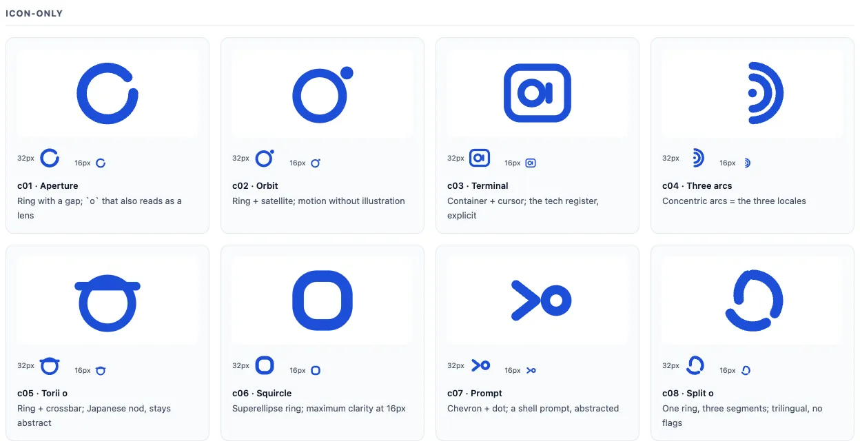
That is the icon half of the sheet. Aperture, orbit, terminal, arcs, torii, squircle, prompt, split. Eight names for one drawing. Every one is a monoline geometric stroke: circles, arcs, even weight, rounded caps. Icon or wordmark, they share a skeleton. That skeleton is the default a language model reaches for, and it is the exact house style of every AI logo generator on the internet. I had asked for range and received repetition wearing eight hats.
The fix was not a better prompt. It was going to look at real work first. Six identities, screenshotted and actually examined:
| Reference | What it does | What round one had done |
|---|---|---|
| Linear, Astro | Solid fills, mark small and quiet | All strokes, which close up at 16px |
| Rauno Freiberg, Josh Comeau | No mark at all. Type plus one committed colour | Assumed a mark was mandatory |
| Maggie Appleton | Display serif. It is a writing site | Geometric sans, the template default |
| Anthony Fu | Personal monogram, hand character | Pure geometry cannot produce “personal” |
Round two came back genuinely different, because this time the constraints came from somewhere real:
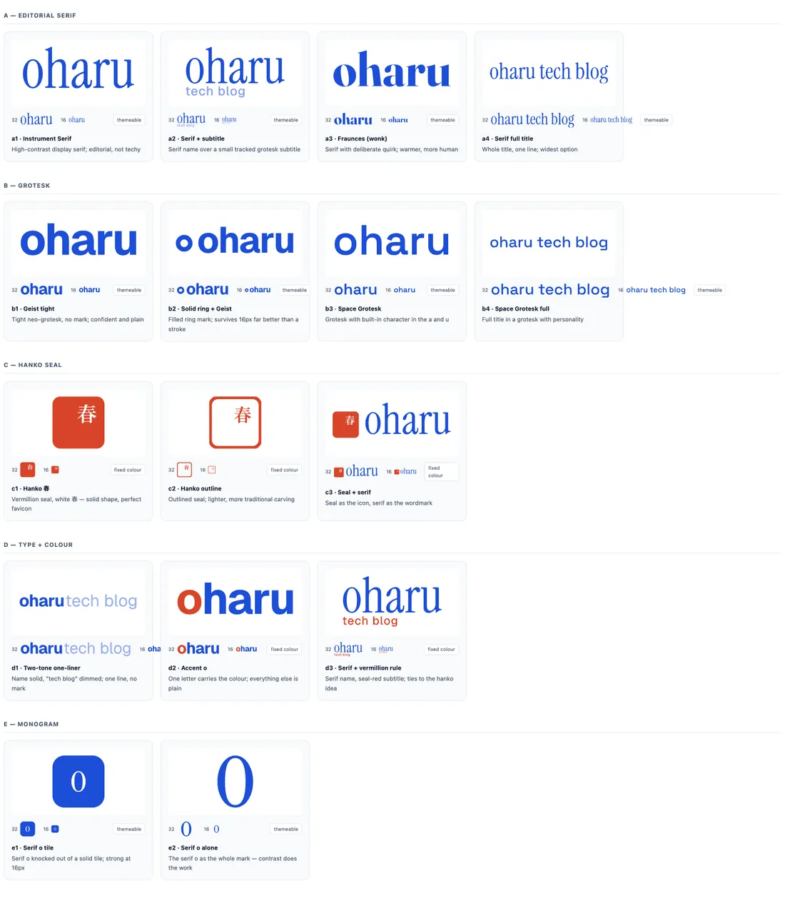
The lesson generalises past logos: an AI asked for N options will give you N samples from one distribution. Breadth has to be imposed from outside, and looking at real work is how you find out what outside looks like.
Wrong turn 2: letterforms that were never rendered
Round one was hand-built geometry, and it went into a gallery without being rendered once. Three bugs were sitting in plain sight.
The worst was the letter u:
M9,49 L9,99 A41,41 0 0 0 91,99 L91,140Read it as a pen. Left stem down from the x-height to y=99. Bowl arc across to
(91,99). Then a line down to the baseline. The arc ends at y=99, so the
right stem only spans 99 to 140: it is missing its entire top half. The
letter renders as a u with a stunted right side.
The fix is a separate subpath:
M9,49 L9,99 A41,41 0 0 0 91,99 ← bowlM91,49 L91,140 ← full-height right stem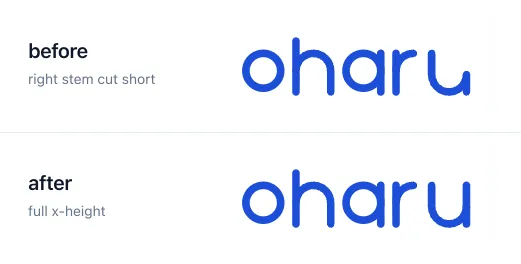
The other two were the same class of error. A subtitle positioned at y=160
and scaled to 0.26 put its ascenders at 160 + 0.26 × (−700) = −22, above
the baseline of the word it sat under, so t, h, b and l punched through
the name. And a mark drawn 220 units tall next to letters 700 units tall read
as a stray bullet point rather than a logo.
Every one of these is obvious in a browser and invisible in the path data. The geometry had been reasoned about and never looked at.
Wrong turn 3: a character the agent assumed
The strongest concept to come out of round two was a hanko, a personal seal, which is close to what a blog actually is. Vermilion, one character, knocked out in white.
The name is “oharu”, so the agent used 春 (haru, spring). It looked good. It nearly got built.
Then it asked, because putting a character into someone’s identity on an assumption is not a thing to do quietly. I corrected it: “oharu” is 桜明. Not 春 at all.
That answer changed the design, not just a glyph. 桜明 is two characters, and two characters cannot survive a 16px favicon: at that size a 10-stroke kanji is texture, not a character.
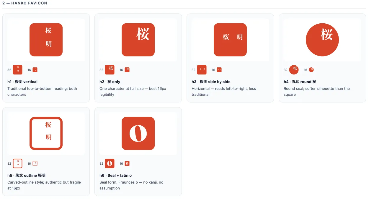
The 16px renderings settle it. 桜明 stacked vertically is the correct hanko for the name and the worst performer in a browser tab; the outlined version disappears entirely. So the seal became round and single-character 桜, and the choice was settled by stroke count rather than taste.
The general version: an AI will happily produce a confident, plausible, well-executed artefact built on a guess about you. The guess is not visible in the output. It has to be asked about.
Wrong turn 4: a bounding box computed with a regex
For the real assets the hand-drawn letters gave way to outlines baked from actual typefaces, Fraunces for the wordmark and Noto Serif JP for 桜, using fontTools and HarfBuzz. Correct kerning and contrast, frozen into path data, so the wordmark ships as geometry with no webfont request and no flash of fallback type.
To place a glyph you need its inked bounds. The script pulled every number out of the path string and treated them as alternating x, y pairs.
That is wrong, and quietly so. SVGPathPen emits H and V shorthand, and
those commands carry a single coordinate. One horizontal line flips the
parity of every number after it.
It survived two rounds of galleries looking merely slightly off. It only became undeniable when a lockup that should have been roughly 3200 units wide came out at 1802.
The fix is to stop parsing text and let the library measure:
from fontTools.pens.boundsPen import BoundsPen
bounds = BoundsPen(glyph_set)for info, pos in zip(buf.glyph_infos, buf.glyph_positions):    xform = (scale, 0, 0, -scale, (x + pos.x_offset) * scale, 0)    glyph_set[name].draw(TransformPen(pen, xform))    glyph_set[name].draw(TransformPen(bounds, xform))   # same transform
Real bounds for the wordmark: 2456.4 × 758.6. The regex had been confidently
returning something else since the first gallery.
This is the failure mode worth singling out: it did not crash. It produced plausible output that a human glanced at and approved, twice.
Wrong turn 5: a preload on every page
The other half of the session was giving code its own typeface. Code blocks are the surface a tech blog is actually read on, and mine were rendering in Menlo, the same “no decision was made” state as the body text.
JetBrains Mono Variable, Latin subset only, 40KB, self-hosted at a fixed path so it can be preloaded by URL. This costs nothing on the Japanese and Chinese pages: code is Latin, so the CJK stacks stay untouched and no CJK font is ever fetched.
The preload went into the shared layout. The browser said why that was wrong:
The resource http://localhost:4321/fonts/jetbrains-mono-latin.woff2 waspreloaded using link preload but not used within a few seconds from thewindow's load event. Please make sure it has an appropriate `as` value andit is preloaded intentionally.The home page, the tag listings and both CJK index pages have no code on them. They were each pulling 40KB to render nothing. Gating it behind a prop that only article pages set:
| Page | rel="preload" links |
|---|---|
dist/index.html |
0 |
dist/ja/index.html |
0 |
dist/tags/index.html |
0 |
dist/blog/<article>/index.html |
1 |
One console warning, one real saving. This is the one wrong turn a tool volunteered on its own. Everything else surfaced only because someone went and looked.
What the rounds became: a /logo skill
Each wrong turn named a rule the next run cannot skip, and those rules are the skill’s non-negotiables, ordered by how much damage skipping them did:
| Rule | Where it came from |
|---|---|
| Study real work before generating anything | Twenty-four concepts from one distribution |
| Render it and look before showing it to anyone | The u with half a stem |
| Judge at 16px | 桜明 as a smudge in a browser tab |
| Never bake in an assumption about the person | 春 |
| Use real typeface outlines, not hand-rolled letterforms | The hand-built geometry, and the regex that measured it |
| Decide colour by comparison, not theory | A blue wordmark beside a red seal |
| The user picks, at every gate | The loop itself |
The last one is the one that makes the rest work. The skill is told to present, recommend with reasons, and stop: an opinion is useful, a decision is not yours. Every round in this article ended at a gate where I chose, which is also why five wrong turns cost an afternoon rather than a finished identity built on a guess.
Three scripts do the mechanical half. gallery.mjs builds the contact sheet and
serves it on a local port, outline.py bakes typeface outlines into path data
through fontTools and HarfBuzz, and build-brand-lockup.mjs is the worked
example that emits the favicon and the header component. Concepts and sheets are
written to a scratch directory, never into the repo: a design round is mostly
rejects, and a repository is not where rejects go.
Wrong turn 5 produced no rule here. A preload firing on pages with no code on them is a layout bug, not a design one, and it belongs to the font half of the session rather than the mark.
What shipped
A vermilion round seal bearing 桜, next to “oharu” set in Fraunces. Two SVGs rather than one, because the seal is deliberately shorter than the wordmark’s ink height, which rules out producing the narrow-screen variant by clipping the full lockup to a square. Below 50rem the seal appears alone, which incidentally solved a layout problem the old text wordmark had, where the title competed with the search control on a phone.
One colour decision was made by looking rather than theorising. The site accent
is #1d4ed8; the seal is #d8452a. Those sit almost opposite each other, and a
blue wordmark beside a red seal visibly fights. The fix was not a different
red. It was letting the wordmark take the theme’s ink and keeping blue for
links, so the two never sit adjacent.
Costs, measured rather than estimated:
| Wordmark path data | 3569 bytes (integer-rounded from 5145) |
| Seal path data | 1677 bytes |
favicon.svg |
1878 bytes |
| JetBrains Mono, Latin subset | 40KB, article pages only |
Webfont requests on /ja/ |
1, and no CJK font |
astro check reports 0 errors, 0 warnings, 0 hints across 53 files.
Summary
Five wrong turns. Not one of them was caught by reasoning about the code.
The generic concepts needed real references to become visible as generic. The broken letterforms needed a browser. The wrong kanji needed a question. The bounding box bug needed a number absurd enough to notice. The wasted preload needed a console.
That list is the argument for running this as a loop rather than as a prompt. Producing twenty-four polished concepts costs minutes now, which makes it very easy to mistake volume for range, and very easy to accept a confident artefact built on a guess. The counterweight is not a better prompt. It is rendering the thing, measuring the thing, and asking when the thing depends on a fact I have and the agent does not.
None of the five felt like waste at the time and none of them reads like waste now, because each one came back as a rule. The next mark starts at seven rules and three scripts instead of at a blank prompt, and that is the part worth keeping.